What Ten Years of European Weather Can — and Cannot — Tell Us About Tomorrow
A honest look at building a weather forecaster, including the four bad numbers that almost ruined it. No data science background needed.
Weather stations record plain numbers: how warm it was, how humid, what the air pressure read. This project asks a simple question — if a computer studies ten years of those numbers from Basel, Switzerland and 17 nearby European cities, can it learn to predict Basel's weather on days it has never seen?
The answer turns out to be more interesting than a simple yes or no, and the most valuable lesson had nothing to do with the algorithm at all.
The data
One row per day from 2000 to 2010 — 3,654 days — with readings for 18 European cities recorded side by side: cloud cover, humidity, air pressure, sunshine, wind and temperature. It comes from Zenodo, a public research archive.
First, four numbers that nearly ruined everything
The standard first step in any analysis is to check for missing data — blank cells where a sensor recorded nothing. This dataset had none, so it looked immaculate.
But a sensor can fail in a second, sneakier way: by reporting a number that is simply wrong. A blank-check will never catch it, because a wrong number is still a number.
Air pressure at sea level is always somewhere near 1 bar — it has never been recorded below about 0.87. Yet hidden in this dataset were readings of -0.099 bar (negative pressure, which cannot physically exist) and 0.0003 bar (very nearly a vacuum). Four days out of 3,654 carried a corrupted reading: about one hundredth of one percent of the data.
Those four rows were enough to make several models score worse than useless.
A model multiplies each input by a weight, so one absurd input produces one absurd output. A single day's pressure prediction missed by more than 700 hPa — and that one day alone dragged an entire model's score below zero, making it worse than simply guessing the average every time.
Here is the same analysis, run before and after removing those four days. Nothing else changed:
| Model | With 4 bad rows | After removing them |
|---|---|---|
| Same-day humidity | −0.10 | 0.80 |
| Same-day pressure | 0.72 | 0.99 |
| Next-day temperature | 0.80 | 0.95 |
| Next-day humidity | −0.25 | 0.51 |
| Next-day pressure | −9.24 | 0.82 |
Scores are R² — see the explanation below. Negative means the model performs worse than guessing the long-term average.
The lesson: checking for blanks is not the same as checking for sense. A handful of impossible values, invisible in any summary table, can quietly wreck an entire analysis — and leave you with a confident-looking model that is worthless.
How the forecaster is built
- Throw out impossible readings. Any pressure outside the physically possible range is treated as a broken sensor, not weather.
- Drop the raw calendar date. A number like
20000101means something to a person but is meaningless as a plain quantity to a model. The month is kept, since it genuinely captures season. - Split by time, not at random. The model learns from 2000–2008 and is tested on 2008–2010. Shuffling days randomly would let it study the future to answer questions about the past — which flatters results and no real forecaster can do.
- Make sure nothing cheats. When estimating Basel's humidity, the model never sees Basel's actual temperature or pressure for that same day.
- Train and test using Linear Regression, a long-established technique that finds the best straight-line relationship between the inputs and the value being predicted.
Part one: filling in the same day
The first experiment asks: given what 17 other cities recorded today, can we work out what Basel recorded today? This is not forecasting — it is closer to reconstructing a reading from a broken sensor by looking at its neighbours.
Two numbers describe the result. Average error is the most readable: it is how far off a typical estimate was, in real units. R² is a 0-to-1 score for how much of the day-to-day pattern the model captured, where 1.0 is perfect and 0 is no better than always guessing the average.
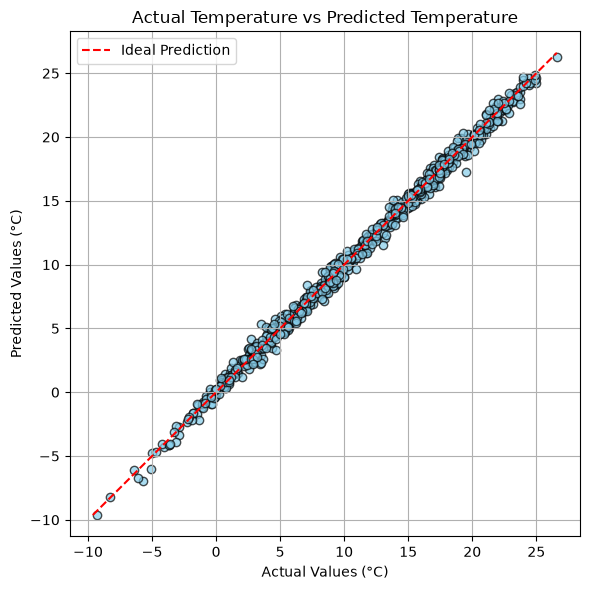
R² = 0.996
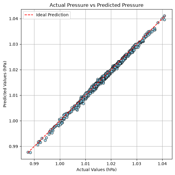
R² = 0.993
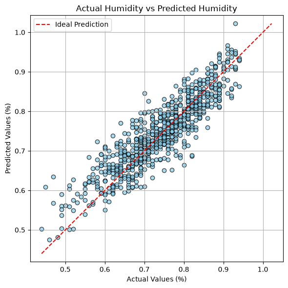
R² = 0.795
But is that actually good?
A high score proves nothing on its own. The real test is whether something far simpler could have done just as well — so we compare against a seasonal average: a lazy "model" that ignores every input and just answers with the historical average for that month.
| Seasonal average | Our model | Improvement | |
|---|---|---|---|
| Temperature | 2.81 °C off | 0.38 °C off | 86% better |
| Pressure | 6.41 hPa off | 0.54 hPa off | 92% better |
| Humidity | 6.93 % off | 3.54 % off | 49% better |
Clear wins across the board. Regional weather moves as one connected system, so the neighbouring cities really do give the answer away — though humidity is noticeably harder, because local fog, rain and cloud can flip it without the whole region shifting.
In the three charts below, each dot is one test day: what actually happened along the bottom, what the model estimated up the side. The red dashed line is where a perfect estimate would land, so the tighter the dots hug it, the better.
Part two: actually predicting tomorrow
Here is where the project gets honest with itself. Everything above uses today's readings to describe today. A real forecast can use only what is known today to say something about tomorrow — a fundamentally harder problem.
So the experiment is rebuilt: inputs are every reading from today (including Basel's own, which a real forecaster obviously knows), and the target is Basel's weather the following day.
The benchmark here is tougher too. Persistence — simply guessing "tomorrow will be the same as today" — is famously hard to beat, because weather really is sluggish from one day to the next.
| "Same as today" | Our forecast | Improvement | |
|---|---|---|---|
| Temperature | 1.64 °C off | 1.30 °C off | 21% better |
| Pressure | 3.64 hPa off | 2.84 hPa off | 22% better |
| Humidity | 6.71 % off | 5.49 % off | 18% better |
The forecast beats persistence on all three measures — a genuine result. But notice that the typical temperature error grew from 0.38 °C to 1.30 °C, more than triple.
That gap is the honest cost of predicting the future rather than describing the present. It is also why you should be sceptical of any weather model advertising near-perfect accuracy: it may not be forecasting at all.
Whose weather tells us most about Basel?
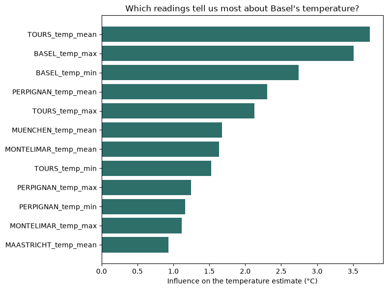
Because a linear model assigns a weight to every input, we can ask which readings actually drive the answer. The inputs sit on wildly different scales, so each weight is adjusted by how much that reading genuinely varies — giving a fair comparison in degrees of influence.
When does the forecast struggle?
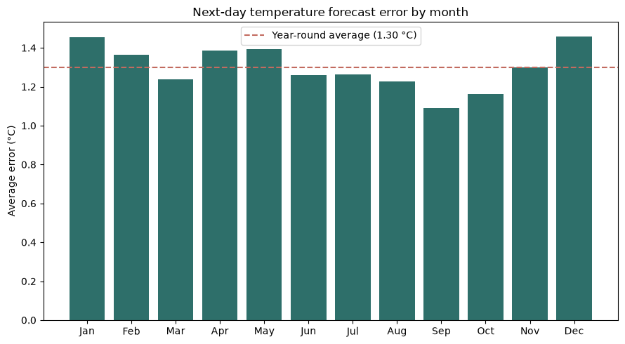
A single average error hides a lot. A model can be dependable in one season and shaky in another, and one number would never reveal it — so the next-day temperature error is broken down month by month.
What we learned
- Data quality beat modelling. Removing four corrupted rows improved the results more than any algorithmic change did. Checking for blanks is not the same as checking for sense.
- Describing today is easy; predicting tomorrow is not. Same-day estimates are near-perfect, but genuine next-day forecasting more than triples the error. Confusing the two makes a model look far better than it is.
- Humidity is the stubborn one in every version of the experiment, because local effects shift it without the whole region moving.
- Always compare against something lazy. A 99% score sounds impressive until a trivial rule scores nearly as well. Baselines turn a number into evidence.
- How you split the data changes the answer. Testing on random days lets a model peek at the future; testing on the most recent years is harder and far more honest.
Limitations, stated plainly: this covers one city over 2000–2010, uses a straight-line model, and forecasts only one day ahead. It is an exercise in evaluating a model honestly — not a working weather service.
See the full analysis
Every line of code, every explanation and every chart lives in the complete notebook: read the full walkthrough, or open weather_predict.ipynb in the repository to run it yourself.